
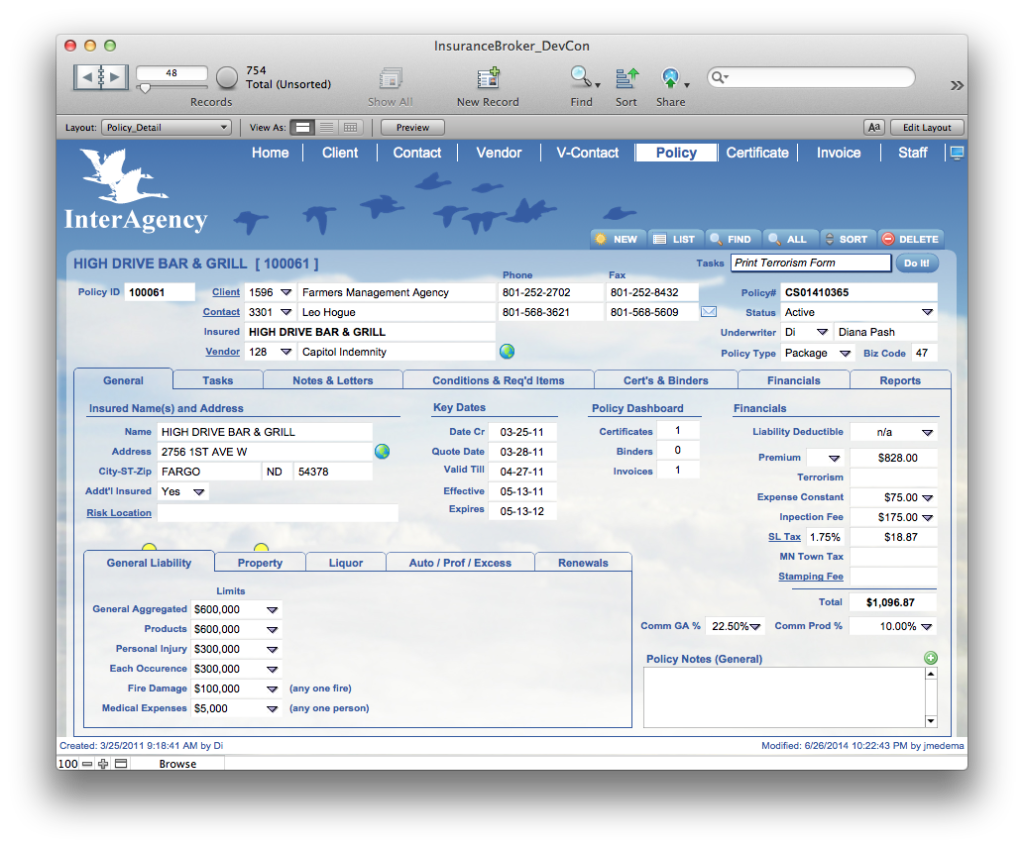
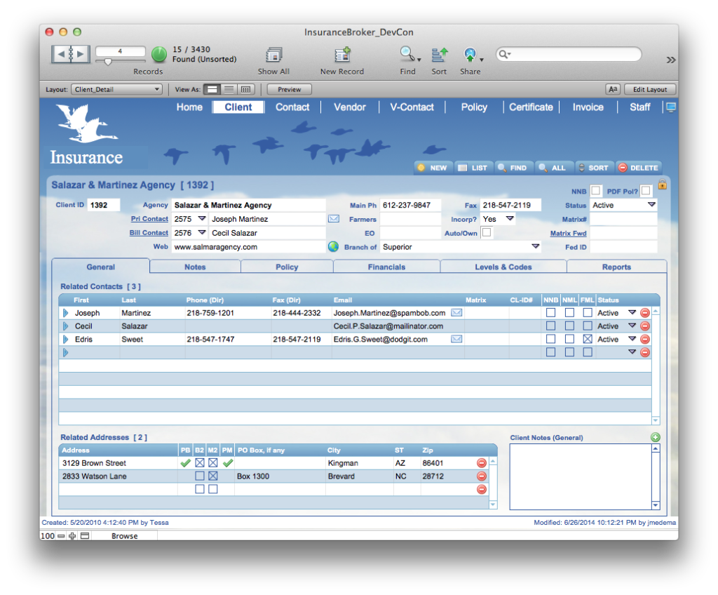
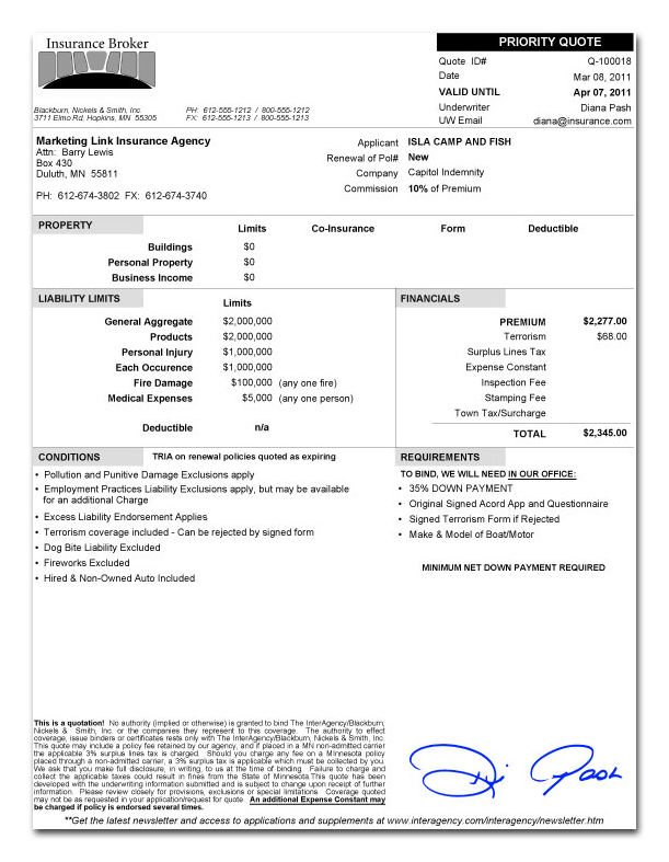
Project Description
Aggregator? While most people know their local insurance agent and can identify insurance companies like All-State, Farmers and Hartford, fewer know what an insurance “aggregator” is. An aggregator serves as a middle-man between local independent insurance agencies and the large insurance providers like Hartford. The small agencies are so small that they are too much of a hassle to manage independently. An aggregator “aggregates” the business of these many small agencies so that collectively they the book of business is large enough for the big insurance providers to pay attention. The aggregator helps provide insurance products to the small agencies and takes a commission as part of the relationship. The solution Surefoot built for this particular aggregator is used to manage their entire insurance business and communicates with their Quickbooks accounting software.
The reason I would like both top and bottom text is that the images capture people’s attention but aren’t the full story. I want to draw them into the text but if they only see the 3-5 paragraphs of text when they first load the page they might not scroll down. (I believe I’m over thinking this) One of the reasons I like the “shrunken” images is they don’t immediately dominate the screen, but instead invite the user to click on them. Once they click they get a much larger view – I LOVE the slideshow thing from Case Study B that you put together! If I had to choose between top or bottom, I’d rather have the images displayed on top, just under the name of the Case Study (is that the client name?), and then put the rest of the Project Description below the images. I’m not sure how best to integrate the client logo with this setup. Maybe at the top of the side-bar??
Insurance Aggregator
Project Description:
ROI:

Client Profile:
Client Type:
Primary Features: